
Multi-Theme System
Objectives
By the end of this chapter, you should be able to:
- Explain why a class-based dark-mode toggle (
.dark) doesn’t scale past two states, and migrate to an attribute-based one that does - Build a four-theme system (light, dark, amber, blue) and a cycle-button UI to switch between them
- Confirm that adding a theme touches only the token definitions and the toggle, never a component that renders UI
💡 Why this matters: The design-token architecture from the first chapter of this module was built specifically so this moment would be cheap. This chapter is where that bet gets paid off, or doesn’t.
From .dark to data-theme
The theme store so far is a boolean: isDark, toggled between two states, backed by one .dark class on <html>. That works cleanly for two themes, but it doesn’t generalize. A boolean has exactly two states by definition — there’s no third value to add. Getting to four themes means replacing the boolean with a small enum and the single class with an attribute that can hold any of several values: <html data-theme="amber"> instead of <html class="dark">. CSS selectors change shape to match ([data-theme="amber"] { ... } instead of .dark { ... }), but every component that reads var(--phosphor) or bg-base needs zero changes — they never referenced .dark or data-theme directly in the first place, only the custom properties those selectors define.
The Theme Module
// apps/web/src/lib/theme.ts
/**
 * Every theme applies as `<html data-theme="...">` -- CSS in globals.css
 * keys off that attribute to redefine the same set of custom properties
 * (--bg-deep, --phosphor, etc.), so no component needs to know which theme
 * is active beyond the couple of places (map tile choice) that care about
 * light vs. dark family. THEME_ORDER is also the cycle order the toggle
 * advances through on each click.
 */
export type ThemePreference = "light" | "dark" | "amber" | "blue";

export const THEME_ORDER: ThemePreference[] = ["light", "dark", "amber", "blue"];

export const THEME_LABEL: Record<ThemePreference, string> = {
  light: "Light",
  dark: "Dark",
  amber: "Amber",
  blue: "Blue",
};

/** Every theme except "light" uses a dark background -- MapPanel picks the CARTO dark basemap for all of these so it doesn't clash with a light Leaflet tile layer. */
const DARK_FAMILY = new Set<ThemePreference>(["dark", "amber", "blue"]);
export function isDarkFamilyTheme(theme: ThemePreference): boolean {
  return DARK_FAMILY.has(theme);
}

export function nextTheme(theme: ThemePreference): ThemePreference {
  const idx = THEME_ORDER.indexOf(theme);
  return THEME_ORDER[(idx + 1) % THEME_ORDER.length];
}

/** Must match the inline no-FOUC script in layout.tsx exactly. */
export const THEME_STORAGE_KEY = "skywatch-theme";

function isThemePreference(value: string | null): value is ThemePreference {
  return value != null && (THEME_ORDER as string[]).includes(value);
}

export function getStoredPreference(): ThemePreference | null {
  if (typeof window === "undefined") return null;
  const stored = window.localStorage.getItem(THEME_STORAGE_KEY);
  return isThemePreference(stored) ? stored : null;
}

/** Only ever resolves to light/dark -- amber and blue are opt-in only via the toggle. */
export function systemPrefersDark(): boolean {
  if (typeof window === "undefined") return false;
  return window.matchMedia("(prefers-color-scheme: dark)").matches;
}

export function applyThemeAttribute(theme: ThemePreference): void {
  document.documentElement.dataset.theme = theme;
}

export function storePreference(theme: ThemePreference): void {
  window.localStorage.setItem(THEME_STORAGE_KEY, theme);
}
Centralizing THEME_ORDER, the storage key, and the DOM-writing functions in one small module, rather than spreading them across the store and the toggle component, is what makes the no-flash script in layout.tsx (which can’t import this module — it runs before any bundle loads) the only other place that needs to independently know the theme list and storage key. Every other piece of code imports from here.
The Store, Rewritten
// apps/web/src/store/useThemeStore.ts
import { create } from "zustand";
import type { ThemePreference } from "@/lib/theme";
import { applyThemeAttribute, isDarkFamilyTheme, nextTheme, storePreference } from "@/lib/theme";

interface ThemeState {
  theme: ThemePreference;
  /** Derived from theme, for the couple of call sites (map tile choice) that only care about light vs. dark family. */
  isDark: boolean;
  /** Reads the attribute the no-FOUC inline script already applied, so the store starts in sync with the DOM. */
  hydrateFromDom: () => void;
  cycle: () => void;
}

export const useThemeStore = create<ThemeState>((set, get) => ({
  theme: "light",
  isDark: false,
  hydrateFromDom: () => {
    if (typeof document === "undefined") return;
    const attr = document.documentElement.dataset.theme as ThemePreference | undefined;
    if (attr) set({ theme: attr, isDark: isDarkFamilyTheme(attr) });
  },
  cycle: () => {
    const next = nextTheme(get().theme);
    applyThemeAttribute(next);
    storePreference(next);
    set({ theme: next, isDark: isDarkFamilyTheme(next) });
  },
}));
isDark survives as a derived field rather than disappearing along with the old boolean-only model. That’s deliberate: MapPanel’s tile-layer choice, and anything else in this app that only ever needed to know “dark family or not,” keeps working with zero changes, reading isDark exactly as before. Only the toggle itself, and anything that wants to show which specific theme is active, needs the new theme field.
hydrateFromDom exists because the store’s initial theme: "light" value is just a placeholder until this runs — the real value was already written to the DOM by the no-flash script before React ever mounted. Call it once, in the component that renders the toggle, so the store catches up to what’s already on screen instead of contradicting it.
The Toggle
// apps/web/src/components/ThemeToggle.tsx
"use client";

import { useEffect } from "react";
import { useThemeStore } from "@/store/useThemeStore";
import { THEME_LABEL, nextTheme } from "@/lib/theme";

/**
 * Cycles through THEME_ORDER on each click (light -> dark -> amber -> blue
 * -> light...). The swatch shows the CURRENT theme's own accent color
 * (var(--phosphor) resolves against whatever data-theme is active) rather
 * than a fixed per-theme icon shape -- with only two themes a sun/moon icon
 * reads fine, but that convention doesn't scale past two states as cleanly
 * as "this dot IS your accent color" does, and it needs no maintenance if
 * a fifth theme is ever added.
 */
export function ThemeToggle() {
  const theme = useThemeStore((s) => s.theme);
  const cycle = useThemeStore((s) => s.cycle);
  const hydrateFromDom = useThemeStore((s) => s.hydrateFromDom);

  useEffect(() => {
    hydrateFromDom();
  }, [hydrateFromDom]);

  const upcoming = THEME_LABEL[nextTheme(theme)];

  return (
    <button
      type="button"
      onClick={cycle}
      aria-label={`Theme: ${THEME_LABEL[theme]} -- click for ${upcoming}`}
      title={`Theme: ${THEME_LABEL[theme]} -- click for ${upcoming}`}
      className="flex h-7 w-7 items-center justify-center rounded-sm border border-line text-text-dim transition-colors hover:border-phosphor-dim hover:text-phosphor"
    >
      <span
        aria-hidden="true"
        className="block h-2.5 w-2.5 rounded-full"
        style={{ background: "var(--phosphor)", boxShadow: "0 0 6px var(--phosphor), 0 0 2px var(--phosphor)" }}
      />
    </button>
  );
}
Four Theme Blocks
/* apps/web/src/app/globals.css -- replace the :root/.dark pair from the previous chapter */
@import "leaflet/dist/leaflet.css";
@import "tailwindcss";

/*
 * :root holds the light theme and doubles as the fallback for any
 * unrecognized/unset data-theme value. Every other theme is a
 * [data-theme="..."] block overriding the same property set -- components
 * never branch on which theme is active.
 */
:root {
  --bg-deep: #eef2f0;
  --bg-panel: #ffffff;
  --bg-panel-raised: #f3f6f4;
  --line: #d3ddd8;
  --phosphor: #0e8a52;
  --phosphor-dim: #4f9d78;
  --phosphor-rgb: 14, 138, 82;
  --text-main: #16211c;
  --text-dim: #5c6b64;
}

/* Original dark theme: green phosphor on near-black blue-gray. */
[data-theme="dark"] {
  --bg-deep: #0a121c;
  --bg-panel: #101a26;
  --bg-panel-raised: #16222f;
  --line: #26394a;
  --phosphor: #4dffab;
  --phosphor-dim: #2a8f61;
  --phosphor-rgb: 77, 255, 171;
  --text-main: #e4eef0;
  --text-dim: #85a0aa;
}

/* Classic amber CRT: warm near-black background, amber phosphor. */
[data-theme="amber"] {
  --bg-deep: #140d06;
  --bg-panel: #1e150a;
  --bg-panel-raised: #271b0d;
  --line: #4a3419;
  --phosphor: #ffb020;
  --phosphor-dim: #a3711f;
  --phosphor-rgb: 255, 176, 32;
  --text-main: #f6e6cf;
  --text-dim: #a9906d;
}

/* Cool blue/cyan CRT: near-black blue background, cyan phosphor. */
[data-theme="blue"] {
  --bg-deep: #060b14;
  --bg-panel: #0b1420;
  --bg-panel-raised: #101d2c;
  --line: #1f3a56;
  --phosphor: #3ec7ff;
  --phosphor-dim: #2a7fa3;
  --phosphor-rgb: 62, 199, 255;
  --text-main: #dbeeff;
  --text-dim: #6f93b3;
}

@theme inline {
  --color-base: var(--bg-deep);
  --color-surface: var(--bg-panel);
  --color-surface-raised: var(--bg-panel-raised);
  --color-line: var(--line);
  --color-phosphor: var(--phosphor);
  --color-phosphor-dim: var(--phosphor-dim);
  --color-fg: var(--text-main);
  --color-fg-dim: var(--text-dim);
  --font-mono: "IBM Plex Mono", ui-monospace, monospace;
  --font-display: "Space Grotesk", ui-sans-serif, sans-serif;
}

/* body/.plane-icon/.leaflet-container rules from the previous chapter are unchanged */
Notice what didn’t change: the @theme inline block, every Tailwind utility name it defines, and every component that uses bg-base or text-fg-dim. Two new theme blocks, defining the same nine property names with new values, are the entire cost of doubling the theme count from two to four.
Updating the No-Flash Script
// apps/web/src/app/layout.tsx -- replace the previous chapter's script
const NO_FLASH_THEME_SCRIPT = `
(function () {
  try {
    var stored = localStorage.getItem('skywatch-theme');
    var known = ['light', 'dark', 'amber', 'blue'];
    var theme = known.indexOf(stored) !== -1
      ? stored
      : (window.matchMedia('(prefers-color-scheme: dark)').matches ? 'dark' : 'light');
    document.documentElement.setAttribute('data-theme', theme);
  } catch (e) {}
})();
`;
The known array here is hand-duplicated from THEME_ORDER in lib/theme.ts on purpose, not imported — this script runs inline, before any JavaScript bundle has loaded, so it can’t import anything. Keep the two lists in sync by hand whenever a theme is added or removed; there’s no way around that given the constraint that this script must be dependency-free.
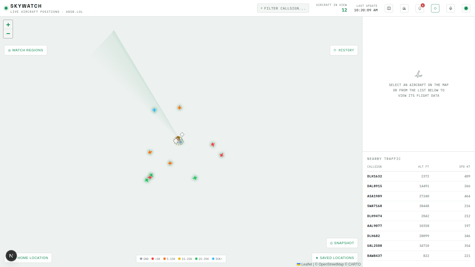
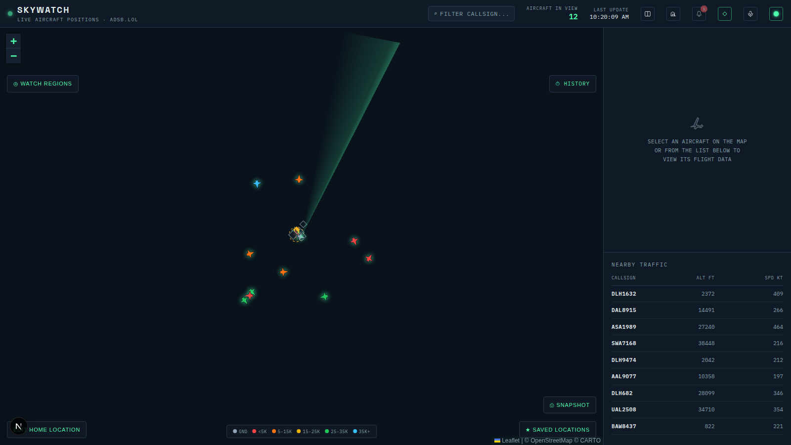
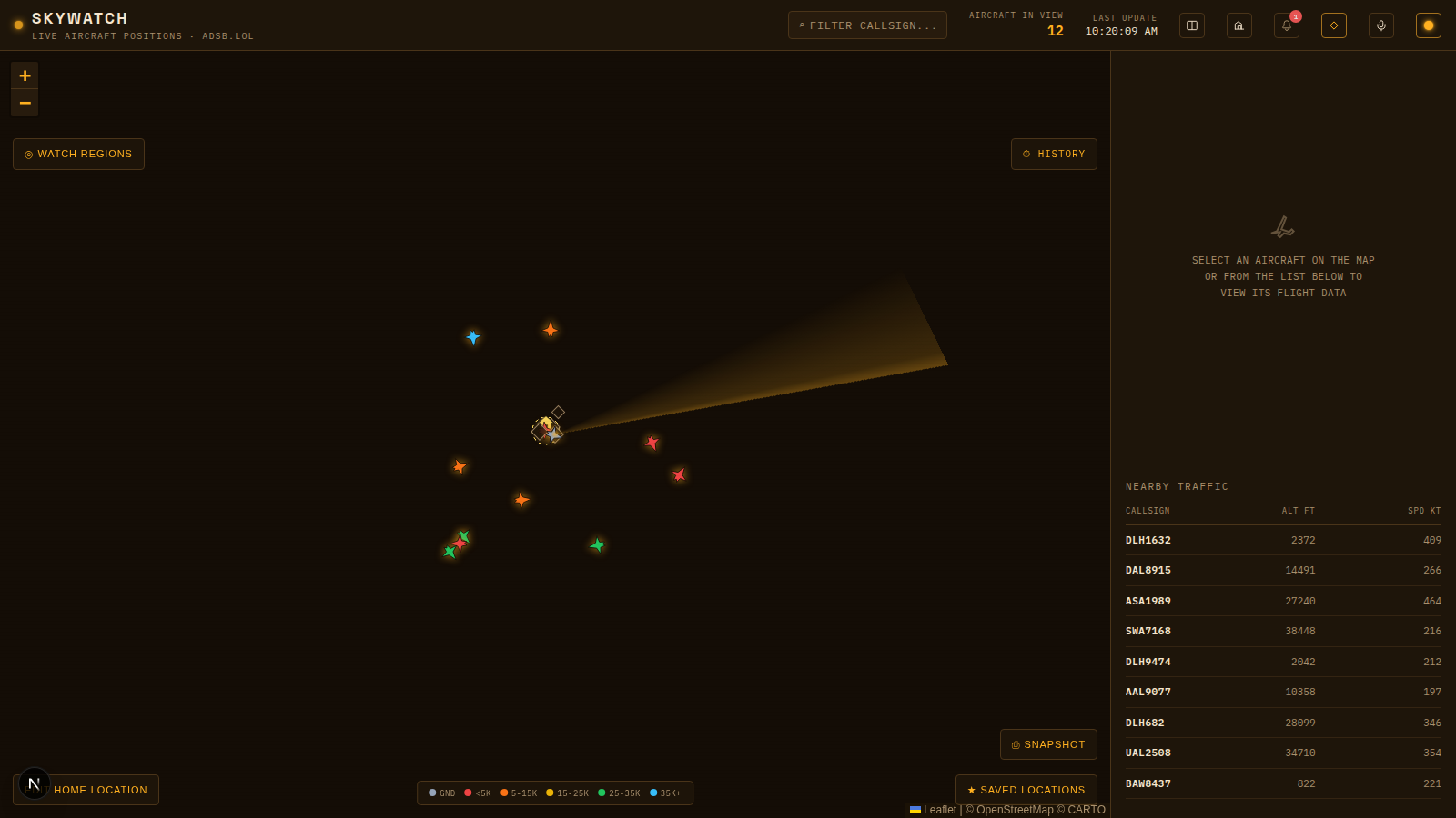
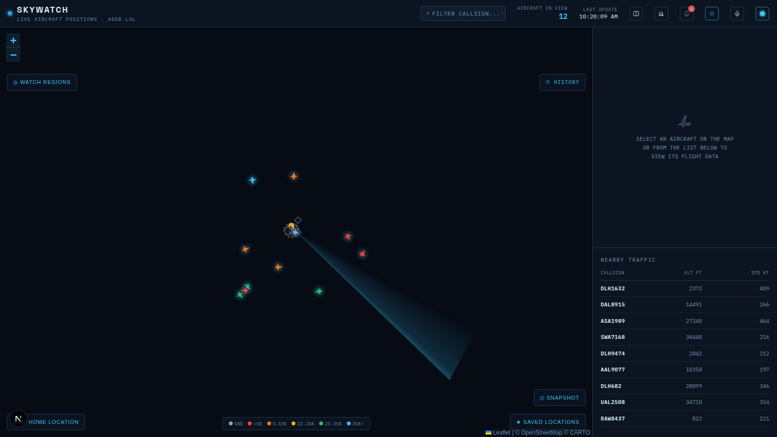
All four themes, same dashboard, same data, only the data-theme block swapped:
Try It
- Swap in the new
theme.ts,useThemeStore.ts,ThemeToggle.tsx,globals.css, and the updated no-flash script. - Click the toggle four times and confirm it cycles light → dark → amber → blue → light, with the swatch color changing to match each theme’s own phosphor accent.
- Set the theme to
amber, reload the page, and confirm it loads directly into amber with no flash of another theme first. - Open dev tools and confirm
<html>has adata-theme="amber"attribute, not aclass="dark"— the migration is complete when nothing in the rendered DOM still depends on the old class. - Search the whole
apps/web/srctree for the literal stringdark:— it should return zero matches. If a component ever grows one, that component broke the pattern this module was built to establish.
Recap
- A boolean can express two states; a small enum plus a
data-themeattribute can express any number. Migrating from.darktodata-themeis what makes going from two themes to four (or more) a token-and-toggle change, not a per-component rewrite. isDarksurvives as a derived field so existing dark-family-only logic (like map tile choice) needs no changes.- The no-flash script can’t import
lib/theme.tsand must be kept in sync with it by hand — a small, deliberate exception to “define it once,” forced by the constraint that this script runs before any bundle loads.
Next module: watch regions, the default region, and history playback.